Generate a synthetic dataset, look at it, and read the checks of the data, sumamrized in a scorecard.
vignette("scorecard") is the reference for better
understanding the synthetic data checks.
The dataset is xgxr::case1_pkpd: 180 patients, six arms
from placebo to 300 mg, with a pharmacokinetic (PK) concentration
endpoint and a continuous pharmacodynamic (PD) endpoint.
Configuration
To run this on your own study, edit the two chunks below that:
- Read in the dataset.
- Define the column roles.
The rest of the code can be kept as is.
library(dplyr)
raw <- as.data.frame(get(utils::data(list = "case1_pkpd", package = "xgxr"))) |>
  mutate(CENS = ifelse(NAME == "PD - Continuous", 0, CENS))
SEED <- 808
The column meanings. Columns not specified here are dropped from the synthetic dataset.
roles <- pmx_roles(
  id           = "ID",
  time         = "TIME",
  dv           = "LIDV",
  cens         = "CENS",
  amt          = "AMT",
  evid         = "EVID",
  cmt          = "CMT",
  dvid         = "NAME",        # which endpoint each observation row is
  nominal_time = "NOMTIME",     # the protocol grid
  strata       = c("TRTACT", "DOSE"), #treatment arms.
  covariates   = "WEIGHTB",     # blended like everything else
  keep         = "STUDY"        # carried through verbatim
)
Generate Synthetic Data
synthetic <- synpmx_avatar(raw, roles, seed = SEED)
#> Warning: Synthetic generation used documented small-group/profile fallbacks:
#> - Endpoint `PD - Continuous` has generated observations at times no donor
#>   was measured at; the cohort's median trajectory was used for those rows.
#>   Expected wherever subjects were sampled on different schedules.
#> - Endpoint `PK Concentration` has generated observations at times no donor
#>   was measured at; the cohort's median trajectory was used for those rows.
#>   Expected wherever subjects were sampled on different schedules.
Plot synthetic data and original data
library(ggplot2)
library(xgxr)
xgx_theme_set()
comparison_colours <- c(source = "#1B6CA8", synthetic = "#D95F02")


both <- rbind(
  cbind(raw[, names(synthetic)], DATA = "source"),
  cbind(synthetic, DATA = "synthetic")
)
obs <- both[both$EVID == 0 & !is.na(both$LIDV), ]
obs$TRTACT <- factor(obs$TRTACT,
                     levels = c("Placebo", "3 mg", "10 mg", "30 mg",
                                "100 mg", "300 mg"))
ggplot(obs[obs$NAME == "PK Concentration" & obs$TIME <= 24, ],
       aes(TIME, LIDV, group = ID, colour = DATA)) +
  geom_line(alpha = 0.4) +
  facet_grid(DATA~TRTACT) +
  xgx_scale_y_log10() +
  xgx_scale_x_time_units("hours", breaks = seq(0, 24, by = 6)) +
  scale_colour_manual(values = comparison_colours) +
  labs(x = "Time (hours)", y = "PK concentration", colour = NULL) +
  theme(legend.position = "top") +
  ggtitle("Day 1 Conc. Profile")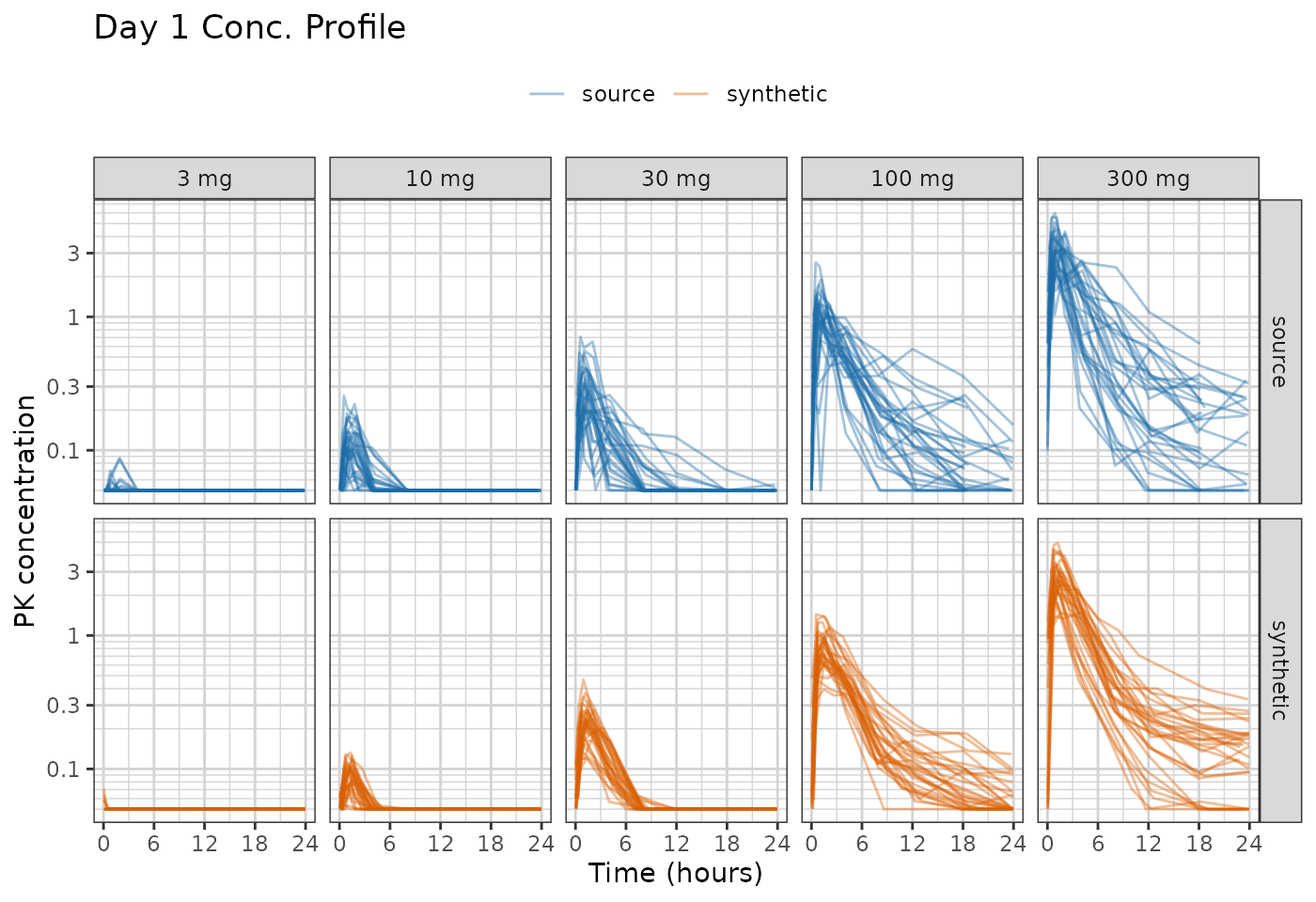
ggplot(obs[obs$NAME == "PD - Continuous", ],
       aes(TIME, LIDV, group = ID, colour = DATA)) +
  geom_line(alpha = 0.35) +
  xgx_scale_x_time_units(units_dataset = "hours", units_plot = "weeks") +
  facet_grid(DATA~TRTACT) +
  scale_colour_manual(values = comparison_colours) +
  labs(x = "Time (hours)", y = "PD (continuous)", colour = NULL) +
  theme(legend.position = "top") +
  ggtitle("PD Response")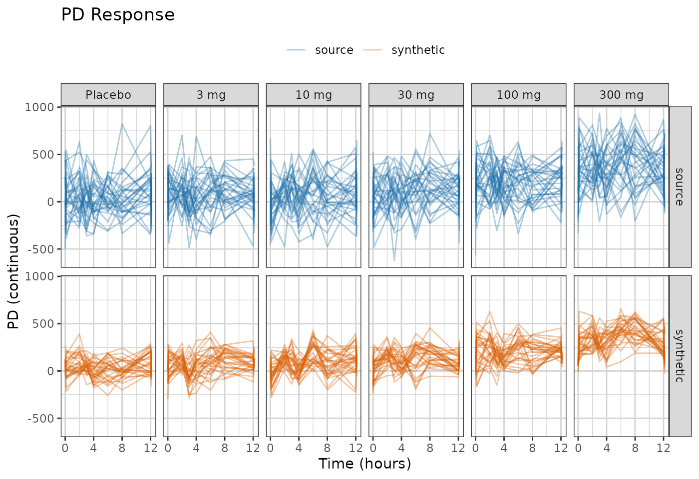
Distributions of Synthetic and Original Data
One panel per endpoint and per baseline covariate, source against
synthetic. compare_pmx_distributions_height() sizes the
figure, since it grows a row of panels at a time;
output = "tables" gives the numbers behind it.
compare_pmx_distributions(raw, synthetic, roles)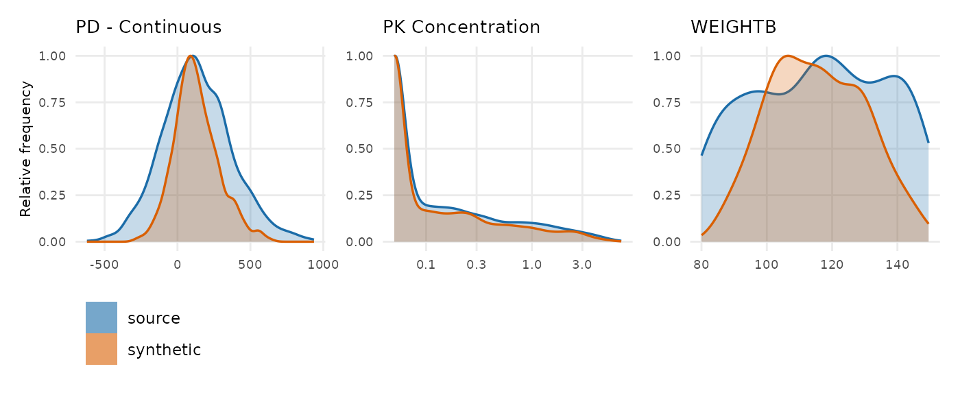
The curves sit on top of each other on both endpoints. Look at their
widths rather than their positions: the orange curve is visibly narrower
than the blue one for the PD endpoint and for baseline weight, and
slightly narrower for PK. That narrowing is between-subject variability
shrinking, which is what the AVATAR blending algorithm does rather than
a fault in the run. output = "tables" puts a number on it,
and the scorecard’s D1 row reports the variable that moved furthest.
The scorecard
The scorecard computes checks of the synthetic dataset. It is
described further in vignette("scorecard").
scorecard <- synpmx_scorecard(raw, synthetic, roles)
synpmx_scorecard_datatable(scorecard)
review is not a soft pass.
Five rows here have no pass mark because no threshold would be honest.
Doses per patient is the clearest: on this study it is unchanged, but on
a study with individualised dosing it can halve.
Every row names the call that explains it. When a
row reads oddly, run what its explore column says: the
numbers are a summary, and the call behind each one is where the answer
is.
Where to go next
-
vignette("scorecard")— every check, what it asks, and what passing means. - Evaluating AVATAR on public data - AVATAR algorithm applied to 8 public datasets.